The Road to 100: How I Achieved Perfect Lighthouse Scores on Every Category
I wrote about building XergioAleX.com — the architecture, the tech stack, the journey from a one-page landing to a full personal platform. Near the end of that post, I mentioned targeting perfect Lighthouse scores across all four categories. This post is about how that actually happened.
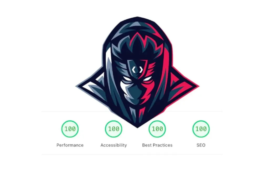
To be clear about what “perfect” means here: 100/100/100/100 on Google PageSpeed Insights — Performance, Accessibility, Best Practices, and SEO — on both mobile and desktop simultaneously. Not a one-time run in ideal conditions. Consistent results.
Here is the thing about Lighthouse scores: Astro gives you an incredible head start. Out of the box, with sensible defaults, you will land somewhere around 90+ on most categories. The framework was designed from the ground up with performance in mind — zero JavaScript by default, static HTML output, islands architecture that isolates interactivity. You get a lot for free.
But the last few points to reach 100 are where the real work lives. Each category has its own specific failure modes, and fixing them requires intentional, targeted effort. Let me walk through each one.
Accessibility — The Foundation (100/100)
This was the biggest lift of the entire project. Getting Accessibility to 100 meant making systematic changes across blog components, home sections, layout components, page components, and the timeline. It was not glamorous work — no clever architecture, no interesting algorithms — but it was the most impactful work I did, because accessibility improvements make the site genuinely better for real users, not just for scoring algorithms.
Color Contrast
The most widespread issue was color contrast. Lighthouse runs automated WCAG contrast ratio checks, and I had been using text-gray-400, text-gray-500, dark:text-gray-400, and dark:text-gray-500 throughout the site for secondary text. These fail WCAG AA’s 4.5:1 minimum for normal text — they look subtle and tasteful on screen, but they are genuinely hard to read for users with low vision or in suboptimal lighting conditions.
The fix was replacing every instance with approved pairings: text-gray-600 dark:text-gray-300. These were chosen carefully — gray-600 (#4b5563) and gray-300 (#d1d5db) maintain the subtle, understated aesthetic while passing contrast requirements. I ended up documenting the approved pairings in AGENTS.md so that every future change — whether made by me or an AI agent — automatically follows the right rules.
ARIA Semantics: Getting Patterns Right
The navigation header was using role="menu" on dropdown menus. This is a surprisingly common mistake — it sounds right, but role="menu" in WAI-ARIA refers specifically to application menus (like the menu bar in a desktop app), not navigation links. Screen readers announce role="menu" items differently, and the expected keyboard behavior is different too. For navigation dropdowns, the correct pattern is the disclosure pattern: aria-expanded on the trigger button, aria-controls pointing to the dropdown container.
Skills progress bars — the kind you see in an About or Resume section — got role="progressbar" with proper aria-valuenow and aria-valuemax attributes. Without these, screen readers have no way to convey what percentage the bar represents.
Decorative icons (chevrons, social media icons used purely as visual elements) got aria-hidden="true" and empty alt="" attributes so screen readers skip them entirely rather than announcing “image” or reading out a file name.
Skip-to-Content and the Main Landmark
Keyboard users navigate sites by tabbing through interactive elements. Without a skip link, every page load requires tabbing through the entire navigation header before reaching the main content. I added a skip-to-content link at the very top of MainLayout.astro — visually hidden by default, visible on focus — that jumps directly to <main id="main-content">.
This is one of those changes that is invisible to most users and transformative for keyboard users. It costs almost nothing to implement and it should be in every site.
Image Dimensions: Preventing Layout Shift
Every <img> element across the site needed explicit width and height attributes. Without them, the browser does not know how much space to reserve for an image before it loads, causing content to shift around as images appear — the dreaded Cumulative Layout Shift (CLS).
Adding dimensions is not complicated, but it requires auditing every image in every component and making sure the specified dimensions match the actual rendered size. This alone can be the difference between CLS of 0 and CLS that tanks both your Accessibility and Performance scores.
Performance — The Hardest 100
This is the category that required the most creative problem-solving. Performance is not just about “add less stuff” — some of the changes required fundamentally rethinking how specific features were implemented.
The Typewriter: From Svelte to Pure CSS
What you see is 100% CSS — zero JavaScript. The same animation that runs in the site's hero.
This was the most interesting technical challenge of the whole project, and the solution I am most proud of.
The hero section had an animated Typewriter component that rotated between different words — “Builder,” “Engineer,” “Maker,” and so on — with a character-by-character typing and erasing effect. It was built in Svelte with client:idle hydration. Lighthouse flagged it: the component was sitting on the critical request chain with 1,338ms of critical path latency. Even with client:idle, the JavaScript for the Typewriter was blocking performance scores.
The solution was to eliminate the JavaScript entirely and rebuild the effect in pure CSS.
The new TypewriterWords.astro component achieves the exact same visual effect using only CSS animations:
/* Each word animates its max-width using ch units and step timing */
@keyframes type-word-1 {
  0%    { max-width: 0ch; }
  /* pause at full width, then erase */
  40%   { max-width: 7ch; }  /* "Builder" = 7 chars */
  60%   { max-width: 7ch; }
  100%  { max-width: 0ch; }
}

.tw-word--1 .tw-text {
  animation: type-word-1 3.5s steps(7, end) infinite;
  /* steps(7) matches character count for frame-perfect stepping */
}
The key insight is using max-width (in ch units — one character-width each) with animation-timing-function: steps(N, end) where N equals the character count of that word. The steps() function creates discrete jumps instead of smooth transitions, which is exactly what a typewriter effect looks like. Each frame, the text grows or shrinks by exactly one character.
The cursor is a border-right on the .tw-text element — it does not need to be positioned separately because it naturally follows the max-width edge.
Centering the component correctly required a three-layer architecture. The outer .tw-word uses absolute positioning to stack all words in the same space. Inside it, .tw-sizer is a visually hidden duplicate of the longest word, sized to hold its full width. The visible .tw-text sits on top and takes its width cue from the animated max-width. This ensures the centering of the entire hero section does not jump around as different-length words appear and disappear.
The component also respects prefers-reduced-motion — if the user has set their OS preference to reduce motion, it shows only the first word with no animation.
The result: the entire Typewriter JavaScript chunk was eliminated. Critical path latency dropped from 1,338ms to 468ms — a 65% reduction.
Responsive Images with srcset
PageSpeed flagged two homepage images as oversized for mobile viewports. On a phone screen, serving the same 1400px-wide WebP as on a desktop is wasteful — the browser downloads 3-4x more pixels than it can display.
The fix was generating responsive variants at 280px, 360px, and 480px widths and then using the srcset attribute with an appropriate sizes declaration:
<img
  src="/images/home/section-image.webp"
  srcset="
    /images/home/section-image-280w.webp 280w,
    /images/home/section-image-360w.webp 360w,
    /images/home/section-image-480w.webp 480w,
    /images/home/section-image.webp 800w
  "
  sizes="(max-width: 640px) 280px, (max-width: 768px) 360px, 480px"
  width="800"
  height="800"
  alt="..."
  loading="lazy"
/>
The browser picks the most appropriate variant based on the viewport size. On a phone, it downloads the right-sized image instead of the full desktop resolution. The savings on mobile viewports are meaningful on slow connections.
SVG Optimization with SVGO
SVG files tend to accumulate cruft over time — editor metadata, redundant path data, unnecessary attributes. Running SVGO on the site’s significant SVGs produced surprising results: the hero and header logos shrank noticeably with no visible quality loss.
Additionally, I added <link rel="preload"> for the header logo SVG. Without it, the browser would discover the logo reference only after parsing the CSS, causing a brief flash of empty space or broken alt text during navigation. Preloading tells the browser to fetch it immediately alongside the HTML.
Font Display and Inline Stylesheets
Two smaller but important changes:
Adding explicit @font-face declarations with font-display: swap ensures that text renders in a system font while the custom Atkinson Hyperlegible font loads, then swaps in. Without font-display: swap, browsers can hold text invisible for up to 3 seconds — the invisible text period that tanked older Lighthouse scores.
Astro’s build.inlineStylesheets: 'always' configuration (which was already in place) inlines all CSS directly into the HTML document, eliminating render-blocking stylesheet requests entirely. The browser does not need to make a separate network request for styles before rendering the page.
SEO — The Infrastructure Layer (100/100)
Getting SEO to 100 was less about any single change and more about a comprehensive audit to fill gaps in the existing foundation.
Structured Data Expansion
The site started with 3 JSON-LD schema types. After the audit, it has 7:
{
  "@context": "https://schema.org",
  "@graph": [
    { "@type": "WebSite", ... },
    { "@type": "Person", ... },
    { "@type": "Organization", ... },
    { "@type": "BlogPosting", ... },
    { "@type": "BreadcrumbList", ... },
    { "@type": "CollectionPage", ... },
    { "@type": "ContactPage", ... }
  ]
}
BlogPosting schema on article pages gives Google structured metadata about the post — author, date published, date modified, headline. BreadcrumbList on every page gives search engines the navigation hierarchy. CollectionPage on the blog listing and tag pages signals that these are index pages, not individual content pages.
Every page on the site now has at least a BreadcrumbList even if it does not have a more specific type. This consistent coverage is what Lighthouse expects for a full SEO score.
Custom 404 Page
Before this work, hitting a missing URL showed the browser’s default error page. I created a bilingual NotFoundPage.astro — properly themed, with dark mode support, navigation links back to the homepage and blog, and appropriate messaging in both English and Spanish. Lighthouse and Google both consider a proper 404 page part of a professional, well-maintained site.
Language-Aware RSS Feed
A subtle bug: the Spanish pages were incorrectly serving the English RSS feed URL in their <link rel="alternate" type="application/rss+xml"> tags. This meant Spanish readers who subscribed via RSS were getting English content. The fix was passing the lang prop through to BaseHead.astro and conditionally serving the correct feed URL.
AI Crawler Optimization
llms.txt — the machine-readable site summary that AI systems use to understand a website’s content — had been accidentally triplicated. The content was repeated three times in the file. Similarly, llms-full.txt had a duplication issue. Both were rewritten cleanly.
robots.txt got updated with entries for additional AI crawlers that had not been listed previously, ensuring proper crawling guidance across the expanding ecosystem of AI agents and search systems.
Web App Manifest
Creating site.webmanifest completed the PWA foundation. The manifest includes the site name, theme colors, display mode, and icon references. I generated the PWA icons programmatically from the SVG favicon using Sharp: 192x192, 512x512, and an apple-touch-icon at 180x180. These are the sizes that browsers and operating systems expect when users add the site to their home screen.
Best Practices — The Details (100/100)
Best Practices is Lighthouse’s catch-all category for “doing things the right way.” The issues here were smaller individually but collectively significant.
Hydration Audit: From client:load to client:visible
Several Svelte components were using client:load unnecessarily. client:load means “hydrate this component immediately when the page loads, even if it is off-screen.” For components that are always below the fold — the Portfolio, TechTalks, Trading, and DailyBot timeline components, plus four ScrollToTimeline instances — this is wasteful. The user pays JavaScript execution cost for components they have not scrolled to yet.
Switching these to client:visible means the component hydrates only when it scrolls into the viewport. For a user who reads the hero section and leaves, those timeline components never load at all. For a user who scrolls all the way down, they load seamlessly as they become visible. The user experience is identical; the performance cost is meaningfully lower.
Lazy Loading for Blog Cards
Blog card images were missing loading="lazy". These are the thumbnail images on the blog listing page — there can be 30 of them. Without lazy loading, the browser attempts to download all of them at once during initial page load. With loading="lazy", images below the fold are deferred until the user scrolls near them. This reduces initial page weight significantly on the blog index.
Cache Headers via Cloudflare
Cloudflare _headers configuration gives granular control over how browsers and CDN nodes cache different file types:
# Hashed asset files (JS, CSS with content hashes in filenames)
/_astro/*
  Cache-Control: public, max-age=31536000, immutable

# Fonts
/fonts/*
  Cache-Control: public, max-age=31536000, immutable

# Images
/images/*
  Cache-Control: public, max-age=2592000

# HTML pages (always revalidate)
/*.html
  Cache-Control: public, max-age=0, must-revalidate
The key insight: Astro generates hashed filenames for JS and CSS bundles (_astro/index.DK3iO3zX.css). Since the filename changes whenever the content changes, these files can be cached forever — the browser will get a new URL when the content updates. Images and fonts change infrequently, so they get long cache times. HTML must always revalidate since it may reference new asset filenames after a deployment.
Favicon Coverage
The site had an SVG favicon — great for modern browsers. But some older browsers, email clients, and social platforms still expect a .ico file. Adding favicon.ico (a multi-resolution file containing both 32x32 and 16x16 icons) ensures complete compatibility without replacing the SVG.
The Results
After all of this work, here is what PageSpeed Insights reports consistently:
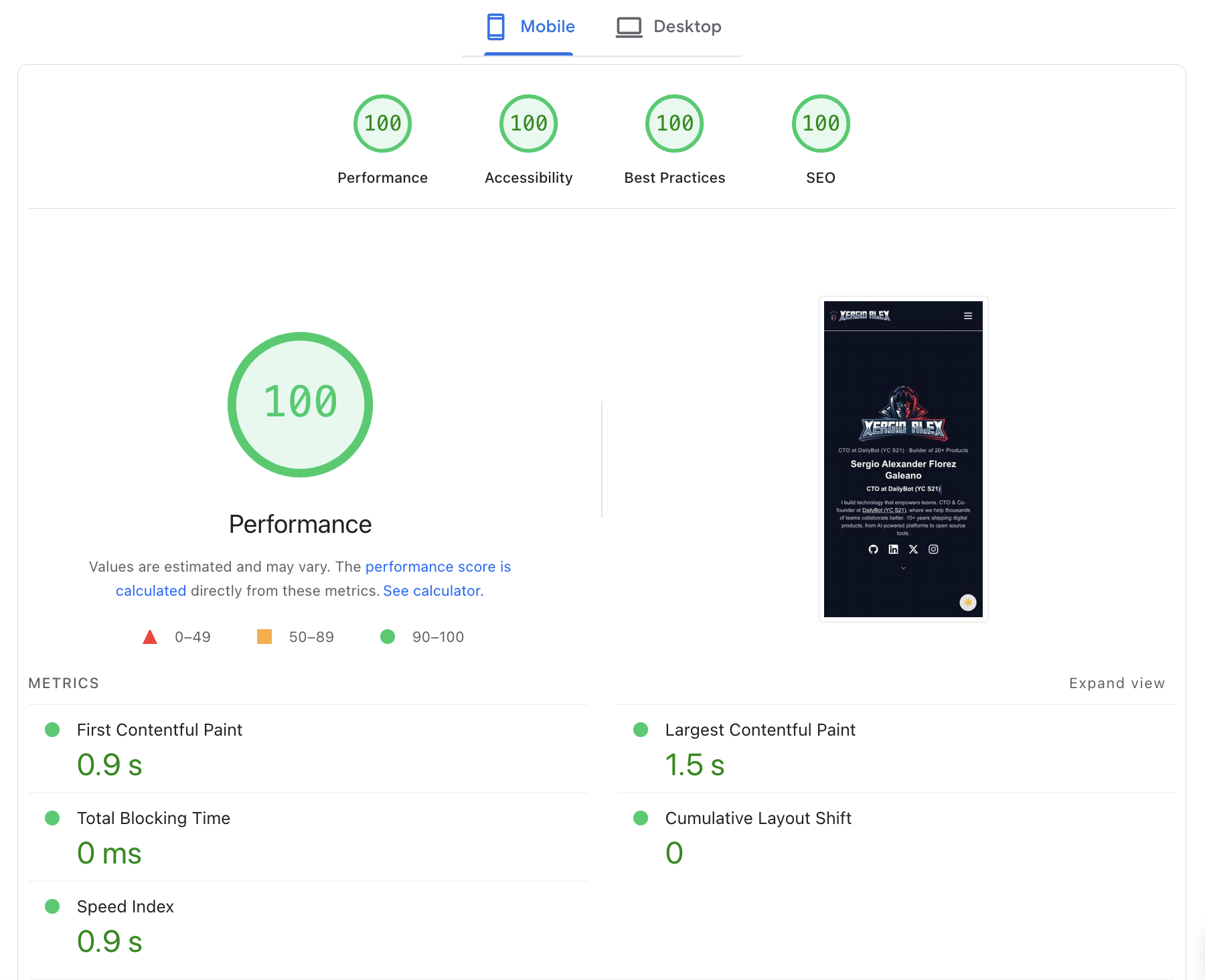
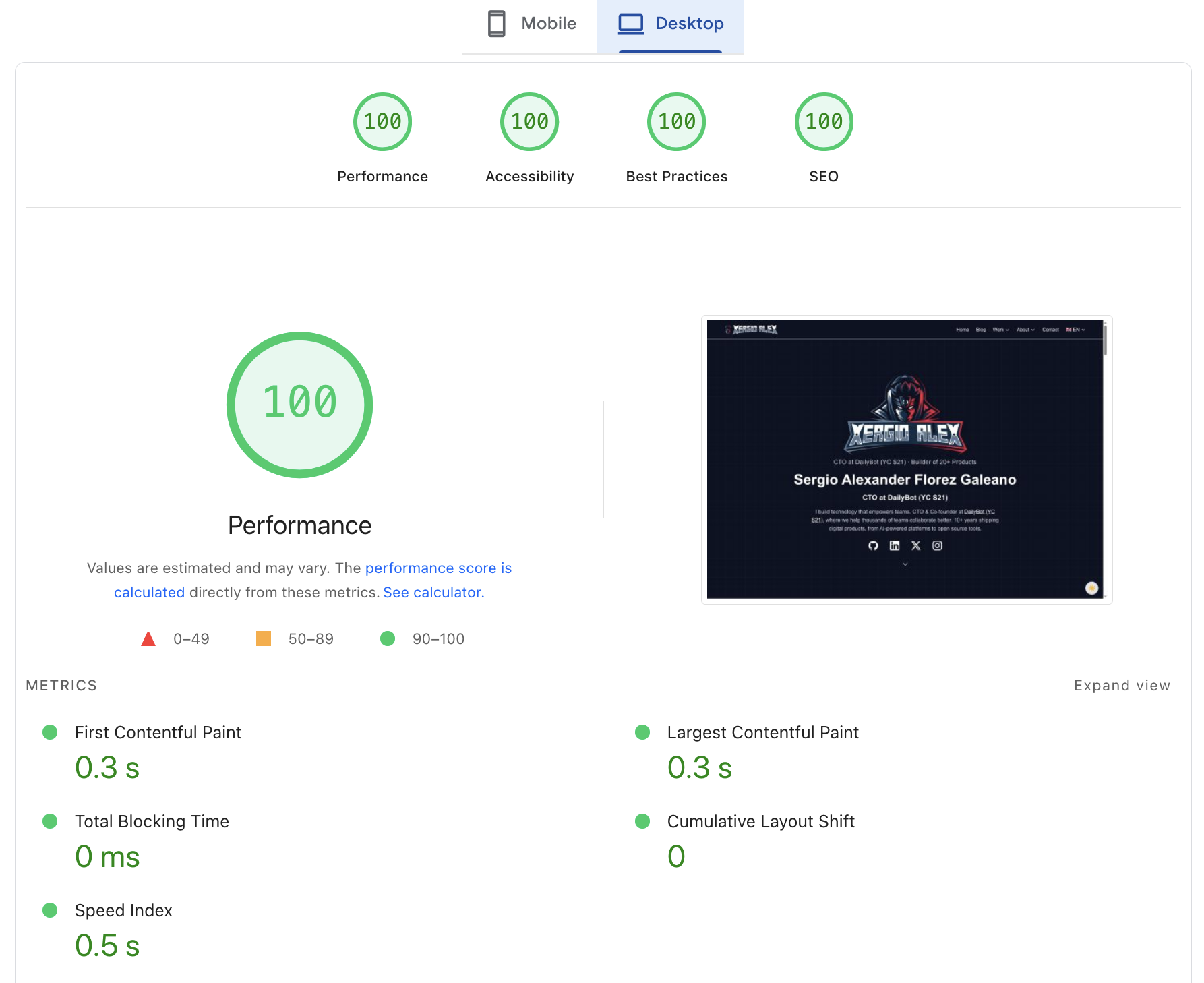
| Metric | Mobile | Desktop |
|---|---|---|
| First Contentful Paint | 0.9s | 0.3s |
| Largest Contentful Paint | 1.5s | 0.3s |
| Total Blocking Time | 0 ms | 0 ms |
| Cumulative Layout Shift | 0 | 0 |
| Speed Index | 0.9s | 0.5s |
Zero Total Blocking Time and zero Cumulative Layout Shift on both mobile and desktop. LCP at 0.3 seconds on desktop. These are not scores I expected to actually see — they look like the example numbers in blog posts about theoretical ideal performance.
What I Actually Learned
The accessibility work was the most impactful, full stop. Not because it moved the score the most — though it did — but because it genuinely makes the site better for real people. WCAG contrast ratios are not bureaucratic theater. Text that barely passes is text that strains eyes in bright sunlight, on old monitors, or for users with visual impairments. Getting the contrast right means the site is actually easier to read. The skip-to-content link costs nothing and is the difference between “usable” and “frustrating” for keyboard users. That work mattered beyond the number.
The CSS-only Typewriter was the most technically satisfying change. There is something deeply pleasing about deleting a JavaScript component entirely and replacing it with a handful of CSS declarations that achieve the same result. The browser was already capable of doing this — I just had not asked it to. The 65% reduction in critical path latency was a bonus; the real win was eliminating the JavaScript dependency.
Performance is not a one-time fix. Lighthouse scores are a snapshot, not a permanent state. Every new feature, every image added, every component refactored can shift the numbers. What this project taught me is that performance needs to be a design constraint from the beginning — not a pass run at the end. The hydration audit would not have been necessary if I had asked “what is the lightest hydration that works here?” from the start. That question is now on my mental checklist for every interactive component.
The whole journey — from the initial Astro build to the accessibility audit to the CSS Typewriter — is documented in the xergioalex.com repository. If you want to dig into the implementation details of any of these changes, it is all there.
Let’s keep building.
Resources
- Building XergioAleX.com — The predecessor post with architecture details
- xergioalex/xergioalex.com — The full source code
- Google PageSpeed Insights — Test your own site
- WCAG 2.1 Contrast Requirements — The official spec for AA contrast ratios
- WAI-ARIA Disclosure Pattern — The correct pattern for navigation dropdowns
- SVGO — SVG optimizer used to compress the logos
- Astro Islands Architecture — How client directives work
- CSS steps() timing function — The key to the CSS-only Typewriter