Building kathelopez.com: The Website I Built for My Wife
My wife needed a website.
Not a startup landing page. Not a SaaS product. A simple professional site for a psychologist building her career in Pereira, Colombia. Katherine — Astrid Katherine López Vanegas — is an ABA therapist who works with children with neurodevelopmental disorders. She’d been growing her practice through referrals and word-of-mouth, but she didn’t have a single place online where a parent could look her up, see her credentials, and reach out.
That’s the kind of problem I can solve in a weekend. So I did.
Why She Needed It
ABA therapy — Applied Behavior Analysis — is a specialized field. Most of Katherine’s clients come through referrals from other professionals or clinics. But here’s the thing: when a parent gets a referral, the first thing they do is Google the name. And if nothing shows up — no website, no professional profile, no way to verify credentials — that referral loses weight.
Katherine had over four years of experience working with children with special needs. She’d worked at Centro APAES, CGI Colombia, and was at Creer IPS Neurorehabilitación Integral. She had certifications in ABA therapy from Fono Genius, a diploma in neuropsychopedagogy, a psychology degree from Universidad Católica de Pereira. Later she’d go on to complete a master’s in clinical neuropsychology at Universidad Internacional de Valencia. All of that — and no web presence.
I wanted to fix that. Not as a developer looking for a project, but as someone who wanted to help his wife’s career.
The Approach: Why I Chose No Framework
I know what you’re thinking. I’m a full-stack developer. I work with Astro, React, serverless architectures, containers, CI/CD pipelines. I could have built this in Next.js. I could have spun up a headless CMS with a custom design system and automated deployments.
I didn’t.
Here’s why: Katherine’s site is a single page. It has an about section, her experience, her services, a contact form, and her credentials. The content changes maybe twice a year — when she finishes a certification or updates her profile photo. There’s no blog, no dynamic content. No user accounts. Nothing that justifies a build step, a framework runtime, or a hosting bill.
So I went with the simplest stack that would do the job: HTML, SCSS, Bootstrap 4, jQuery, and GitHub Pages. Total hosting cost: zero. Total framework overhead: zero. Time to deploy: push to master.
Honestly, the hardest part wasn’t the technology. It was resisting the urge to overengineer it. I caught myself, more than once, thinking about adding a CMS “just in case” or setting up a proper build pipeline with Webpack. I had to remind myself: this isn’t for me. It’s for Kathe. She needs it to work, look professional, and stay up. That’s it.
What the Site Does
The site is a single index.html with several sections, all on one scrollable page.
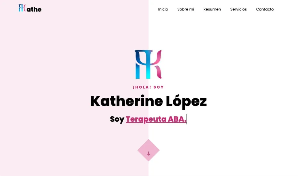
The Hero
At the top, a full-width banner with her name and a rotating text animation — the kind where words cycle through one by one:
Soy Psicóloga. / Terapeuta. / Terapeuta ABA. / Neuropsicóloga.
Simple CSS animation. Gives visitors an immediate sense of what she does without reading a paragraph.
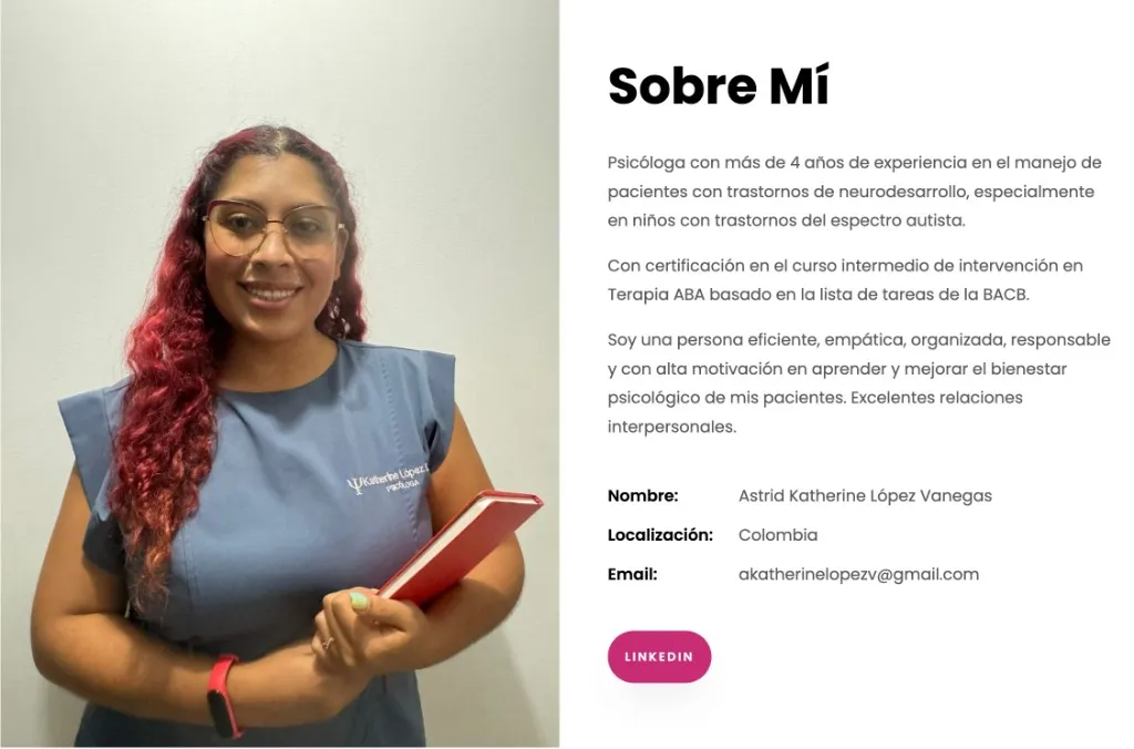
About Me
Her professional bio — who she is, her philosophy, her approach to therapy. The tone is warm and direct: she describes herself as empathetic, organized, and committed to improving her patients’ psychological wellbeing. There’s a professional photo next to the text.
The resume section uses a tabbed layout — Experience, Education, Certifications, Skills — so visitors can go straight to what they’re looking for. Services is focused on in-home ABA therapy: Katherine goes to the child’s home, not the other way around. That’s the real differentiator. For the polish, AOS for subtle scroll animations, Bootstrap handling the responsive layout without a single hand-written media query, and a decorative parallax effect on a few sections.
Contact Form
For the contact form, the obvious solution was a backend — Node.js, a serverless function, something like that. Instead, I used Google Forms.
I reverse-engineered the submission endpoint and wired up a custom HTML form that POSTs directly to Google. Data goes to a Spreadsheet, Katherine gets an email. No server, no API keys, nothing to maintain. It came together faster than I expected. Once it worked, it just kept working.
The full technique is in How to Submit Google Forms via Postman and Ajax.
Hosting: GitHub Pages
The entire site is hosted on GitHub Pages with a custom domain — kathelopez.com. Free HTTPS, automatic deployments on push, zero configuration beyond a CNAME file. No Vercel, no Netlify, no VPS. Push to master and it’s live. For a site that gets updated twice a year, it’s exactly what you need.
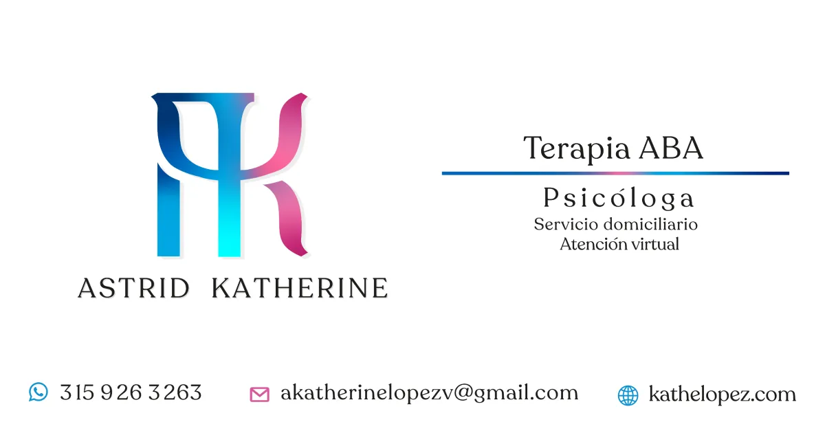
The Brand
The initial version used a generic color scheme and no logo. In February 2021 we redesigned it, with help from Julián Andrés — Katherine’s cousin and an artist (@nailuj.art) — who stepped in to handle the design.
The logo is a fusion of the letter K for Katherine and the psychology symbol — the Greek letter psi (Ψ). The final result merges both shapes into a monogram that reads as AK — her initials, Astrid Katherine — but that any psychologist would recognize instantly.

The primary color is #c82c75 — a vibrant pink/magenta she picked. Not my first choice, honestly. I would have gone with something more muted. But it’s her site, her brand, her personality. And looking at it now, it works. Poppins from Google Fonts for the typography, and that’s it.
The logo appears in the SEO card when someone shares the link — her monogram, her services, her contact info. Clean, recognizable.
What I Learned
Building for someone you love is different from building for a client. There’s no scope document, no sprint planning. Just: what does she need, and how do I make it good?
And the answer, in this case, was: keep it simple.
I could have used this project as a playground for new tech. I could have tried out a static site generator, set up automated deployments, added a contact form backend with serverless functions. But none of that would have served Katherine better. She doesn’t need a CI/CD pipeline. She needs a page that loads fast, looks professional, and has a way for people to contact her.
The right tool for the job isn’t always the newest one. Sometimes it’s Bootstrap 4, jQuery, and a single HTML file deployed to GitHub Pages for free. And that’s fine.
I also learned something about maintenance. When you build something simple, maintenance is simple too. I don’t dread updating her site. No npm audit spitting out 47 vulnerabilities. No framework breaking changes, no Webpack config to debug. I open index.html, change what needs changing, push, and it’s done. That simplicity isn’t a constraint — it’s a feature I chose on purpose.
Katherine’s site has helped her connect with families, show her credentials, and present herself professionally. It didn’t need React or a database. It needed to exist, look good, and be easy to find.
The site’s still up. Katherine’s still getting clients. That’s enough.
Resources
- GitHub repository: xergioalex/kathelopez.com
- Live website: kathelopez.com

Stay in the loop
Get notified when I publish something new. No spam, unsubscribe anytime.
No spam. Unsubscribe anytime.