Building Rocka.co: The Story Behind a Tech Venture Builder Website
Some projects are just work. You take the brief, you write the code, you ship it. Others get under your skin. They become part of your story — woven into the memories of late-night coding sessions, whiteboard arguments about colors, and that specific kind of energy that only happens when the people building something truly believe in what they’re making.
Building the Rocka.co website was one of those projects.
Rocka isn’t just a company I worked with. It’s the incubator where DailyBot was born — where a group of makers, builders, and entrepreneurs came together to experiment, prototype, and ship products from scratch. It’s where I spent years pushing code, breaking things, learning by doing, and building in what felt like permanent hackathons. So when the time came to build the corporate website — the digital front door that would tell the world who Rocka is — it wasn’t just another project. It was personal.
The vision: Rocka as a solid rock
Before a single line of code was written, we needed to answer a fundamental question: what does Rocka feel like?
We brought in Sergio Ruiz, a prestigious designer whose portfolio speaks for itself. Working with Sergio was one of the best decisions we made — he didn’t just design screens, he helped us find a visual language that captured something essential about what Rocka is.
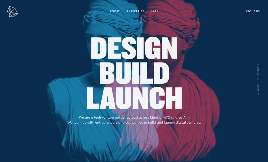
The concept was bold: Rocka is an asteroid — a solid rock from which great products are born. Think of it as a foundation. A launchpad. Something massive and grounded that sends things into orbit. That metaphor became the backbone of everything visual on the site.
And then came the idea that elevated the whole project — classical statues as the visual identity.
Gods and statues: design as metaphor
Sergio proposed using classical Greek and Roman statues as the central visual element. Not decorative filler — each statue represented a pillar of what Rocka does as a tech venture builder.
The Discobolus — the famous Greek disc thrower — became the visual face of the Boost service (Fractional CTO/CPO). It represents action, momentum, the kinetic energy of pushing a business forward. When a company needs experienced leadership to accelerate their technology and product — that’s Discobolus throwing the disc.
Poseidon — god of the sea, wielder of the trident — was paired with the Enterprise service (Tech Due Diligence). Authority. Depth. The ability to see beneath the surface and understand the true state of a technology stack. When investors need a clear-eyed technical assessment of a startup before investing — that’s Poseidon.
The statues appear everywhere on the site — in the hero sections with parallax effects, in the contact modal on hover, as background elements in different sections. Each statue has a dual-layer treatment: the image itself plus a shadow layer, each moving at different parallax speeds to create a sense of depth and three-dimensionality.
The connection to “Rocka” is implicit but powerful. Rock. Stone. Classical sculptures carved from marble. Solidity. Permanence. Foundations that last. It all ties together without ever needing to explain it explicitly.
The color palette and typography
Sergio built the visual system around three colors that work like characters in a story.
A deep, almost-black navy dominates everything — the backgrounds, the hero sections, the space between elements. It’s the night sky. The ocean floor. It gives the site that immersive, cinematic feeling where the statues and text seem to float against infinity. Then a vibrant red cuts through — energetic, impossible to ignore — marking the moments that demand attention. And an electric blue provides the technological counterpoint — clarity, precision, the cool complement to the red’s heat.
Together, the three colors create contrast without chaos. The navy pulls you in. The red wakes you up. The blue guides you forward.
For typography, we chose a clean, geometric typeface for body text, paired with heavyweight condensed display headings that give the hero sections a bold, almost brutalist presence. When you see “DESIGN. BUILD. LAUNCH.” against a navy background with classical statues — it hits different.
The tech stack: Hugo and the tools
For the technical foundation, we chose Hugo — the static site generator written in Go. At the time, Hugo was the fastest SSG available, and for a corporate site that would be mostly content-driven with rich visual effects, it was the perfect choice.
The stack is what you’d expect from a frontend project of this era: Hugo generates the site, SCSS for modular styles, Bootstrap 4 (yes, the alpha version — we’re early adopters), jQuery for the DOM, and a handful of specialized libraries for particles, scroll animations, carousels, and the footer clocks. Grunt orchestrates the build and Babel transpiles our ES6.
Are these the most cutting-edge tools in the world? Some are already on the decline, but they work, the ecosystem supports them, and they let us focus on what matters — building a site that looks and feels like Rocka. The tools aren’t the point. The craft is.
The custom parallax: depth through code
One of the technical highlights of the site is the custom parallax system. We didn’t use an external library — we wrote our own plugin. The concept is simple: as the user scrolls, different elements move at different speeds, creating an illusion of depth. The statues and their shadows shift at different rates, giving the site that three-dimensional feeling we’re after. The key technical trick is using transforms that trigger GPU acceleration in the browser — essential for smooth 60fps animations.
But here’s where pragmatism enters the picture: we disabled parallax entirely on Safari. Safari has rendering issues with complex parallax calculations that cause janky scrolling. Rather than fighting the browser, we chose the user’s experience — Safari users see the site without parallax, and it still looks great.
Similarly, scroll animations are disabled on mobile. Not because they don’t work, but because on slower hardware they can cause stuttering. Performance over aesthetics. Always.
Particles, colors, and atmosphere
Floating particles connected by thin lines drift slowly across the background of each section. Their colors adapt to the context — they blend with the background, never compete with it. And they start static: they only begin moving when the user scrolls into view. A small performance detail, but the kind of decision that adds up.
The most immersive effect is that the background color of the entire page changes dynamically based on which section you’re viewing. From the deep navy of the hero to the vibrant red of Boost, to the electric blue of Tech Due Diligence, to the soft grey of Labs. The transition is subtle but transforms the scrolling experience into something cinematic.
On mobile, we simplify: no dynamic background, no particle movement. Every visual decision has this dual nature — the full experience on desktop, a clean and fluid version on mobile.
The clocks: we’re everywhere
One of my favorite details is the footer. Three analog clocks showing the current time in Madrid (MAD), New York (NYC), and Medellín (MED) — the three cities where Rocka’s team is distributed.
These aren’t decorative images — they’re real-time clocks that calculate the current time for each timezone and display it with hands that move live.
It’s a subtle but meaningful detail. The message is implicit: we’re distributed, we’re always working, and we embrace it. It ties directly into Rocka’s values — Remote. Flexible. Focused. — without ever having to spell it out in a paragraph of corporate text.
Storytelling in the copy
Speaking of text — one of the things that makes the Rocka site special is the copy. This isn’t generic corporate speak. Every section tells a story.
The About page opens with: “In a galaxy far far away…” — a nod to Star Wars that immediately sets a playful, human tone. It continues: “We were born as tech entrepreneurs, willing to create digital products to solve big problems, and willing to do so for our lifetime.”
The Labs section declares: “Makers. Builders. Creators.” Three words that capture everything about the culture — the permanent hackathons, the late-night coding sessions, the prototypes that eventually became real products like DailyBot and Bambú.
And the recurring metaphor that ties it all together: “help you establishing the technical foundation (a solid ‘rock’) for the future of your business.” Rocka. Rock. Foundation. Everything connects back to that central idea.
The “WE MAKE IMPACT” heading on the About page has its own visual trick — three overlapping text layers in red, blue, and primary navy, each moving at different parallax speeds. As you scroll, the layers separate and converge, creating a typographic depth effect that reinforces the message.
What the site communicates
Beyond the visual effects and technical implementation, the Rocka site does something that many corporate websites fail at — it communicates identity through design, not just through words.
The three pillars of the business are clear:
- Boost — Fractional CTO/CPO service. “15h/week of experienced leadership to move your business forward.” The Discobolus statue. Momentum. Action.
- Tech Due Diligence — A service for investors and founders. “Get an executive report about the startup status in terms of tech, infrastructure, frameworks, security, and product development practices.” Poseidon. Authority. Depth.
- Rocka Labs — The product laboratory. “We are constantly researching and shipping new products from our Lab.” Makers building DailyBot, Bambú, Breeze, and more.
The team distributed across Madrid, NYC, and Medellín — visible in the footer clocks. The maker culture — visible in the Labs section and the “permanent hackathons” narrative. The entrepreneurial DNA — visible in the leadership section where founders with Y Combinator backing and 15+ years of experience stand behind the brand.
Design is communication. Every parallax effect, every color transition, every statue choice was deliberate.
CSS Design Awards: Special Kudos
After launch, we submitted the site to CSS Design Awards — one of the most respected platforms for recognizing exceptional web design.
The result: Special Kudos 2017.
The judges scored it:
- UI Design: 7.25 / 10
- UX Design: 7.10 / 10
- Innovation: 6.97 / 10
Receiving recognition from an international design community meant a lot to the team. Not because of the scores themselves — but because it validated the approach. A static site built with Hugo, animated with custom JavaScript, designed around classical statues as metaphors — it worked. It resonated. People outside our bubble saw it and said: this is good.
For a small distributed team building everything in-house, that kind of external validation matters more than you’d think.
Lessons and reflections
Building rocka.co taught me things that I carry with me to this day:
A static site can be immersive. There’s a misconception that “static” means “boring” or “limited.” Rocka.co proves otherwise. With parallax, particles, scroll animations, dynamic colors, and real-time clocks — all served from static HTML files — you can create an experience that feels alive and dynamic without any server-side rendering or heavy JavaScript frameworks.
Design should tell a story. The statues weren’t just decoration. The clocks weren’t just widgets. The color transitions weren’t just effects. Every design decision communicated something about who Rocka is and what it values. The best websites don’t just look good — they mean something.
Performance is a design decision. Disabling parallax on Safari. Turning off animations on mobile. Starting particles in a static state. These aren’t compromises — they’re design choices that prioritize the user’s experience over the developer’s ego.
The tools don’t matter as much as the craft. We built this with Bower, Grunt, jQuery, and Bootstrap 4 alpha. The ecosystem moves fast and some of these tools will likely be replaced soon, but the site stands, it looks great, and it communicates exactly what Rocka is. The tools are a means. The craft is what lasts.
And on a personal level — Rocka is where it all started for me. The experiments, the products, the maker culture. DailyBot began as one of those late-night Lab ideas. Building the website was a way of packaging all that energy and intention into something the world could see.
I’m proud of what we built. Not just the website — but everything it represents.
Let’s keep building.
Resources
- Rocka.co — The live website
- CSS Design Awards — Rocka — Special Kudos 2017
- DailyBot — One of the products born from Rocka Labs
- Hugo — The static site generator used
- Particles.js — The particle effects library
- AOS — Animate On Scroll library