I gave a talk on CSS Grid Layout in early 2020, and honestly, it was as much for me as it was for the audience. I’d been using Flexbox for years — it solved so many problems — but I kept running into situations where it just felt awkward. Nested flex containers, weird margin hacks, fighting with alignment across both axes at once. I knew Grid existed, but I hadn’t really sat down and learned it properly.
So I did. And it changed how I approach layout entirely.
Why Grid Mattered to Me
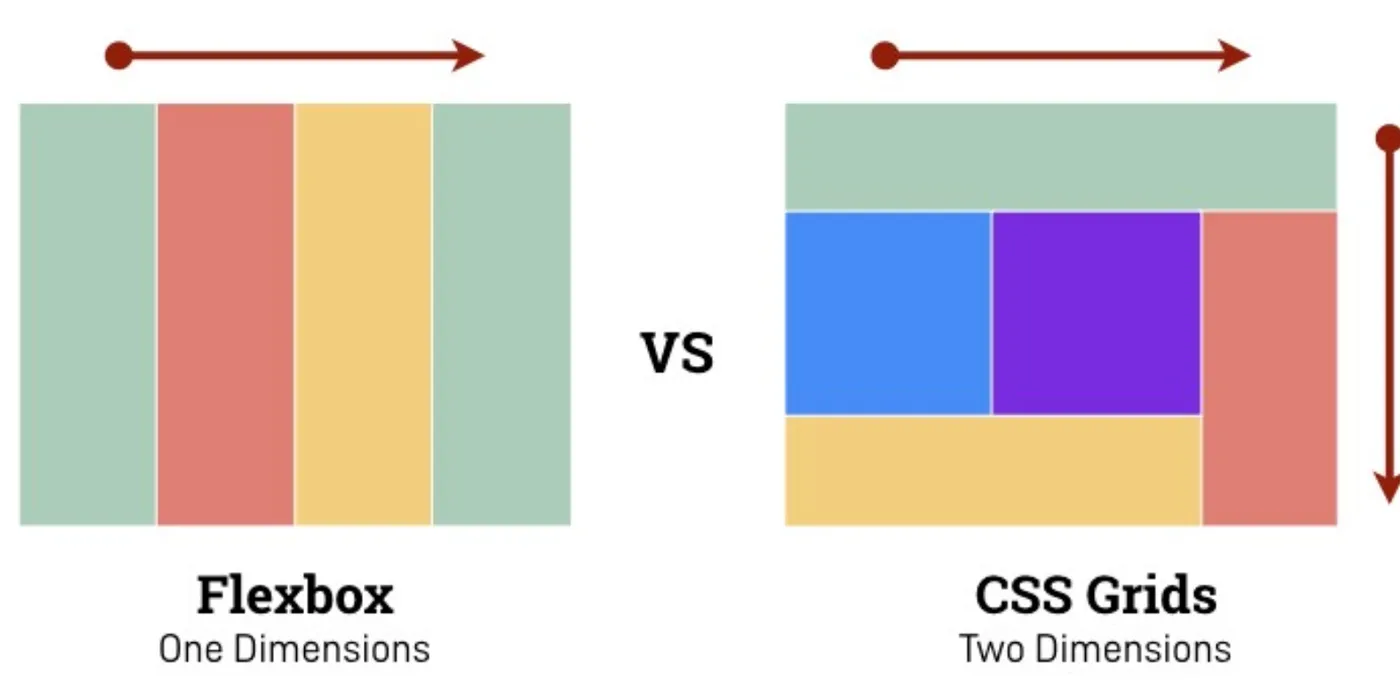
For the longest time, Flexbox was my go-to. It’s brilliant for one-dimensional layouts — rows or columns, not both. But the moment you need to control placement in two dimensions simultaneously, Flexbox starts to feel like the wrong tool. You can make it work, but you’re working against it, not with it.
CSS Grid gave me that two-dimensional control natively. Rows and columns at the same time. Explicit placement. Named grid areas. It felt like unlocking a new level of precision.
The talk wasn’t meant to say “stop using Flexbox.” It was about understanding when each tool makes sense and how to combine them. Flexbox for components, Grid for page structure. That’s the pattern I landed on.
Display: Flex vs Grid
Both properties modify how child elements are laid out, but they’re fundamentally different:
Display Flex — One-dimensional layout. You define a primary axis (row or column) and items flow along it. Perfect for navigation bars, button groups, card content alignment. Flexbox has been in browsers longer, so there’s a ton of resources — cheatsheets, interactive tutorials, battle-tested patterns.
Display Grid — Two-dimensional layout. You define rows and columns explicitly, and items can span across both. It’s been widely supported in browsers since 2017. Current compatibility is excellent — all modern browsers, even IE11 with some fallbacks.
The key difference: Flexbox is about distributing space along a line. Grid is about placing items in a grid.
Flexbox vs Grid: When to Use What
This was the core of the talk. People kept asking me: “Should I use Flexbox or Grid?” And the answer is always: it depends on the layout problem you’re solving.
Use Flexbox when:
- You have a single row or column of items
- You want items to wrap and reflow dynamically
- You care more about alignment and distribution than precise placement
- You’re building a component (button group, card footer, nav bar)
Use Grid when:
- You need to control both rows and columns
- You want explicit placement (e.g., “this goes in row 2, column 3”)
- You’re building page-level layouts (header, sidebar, main, footer)
- You need items to overlap or span multiple areas
Use both when:
- Grid defines the overall page structure
- Flexbox handles alignment inside each grid cell
- This is the pattern I use most often now
The talk included side-by-side comparisons of the same layout built with Flexbox (nested containers, lots of wrappers) vs Grid (clean, explicit, fewer elements). Grid won every time for readability.
Demo Time: Learning by Building
I shared two practical exercises I built to really internalize how Grid works. Reading docs is useful, but building real layouts is where it clicks.
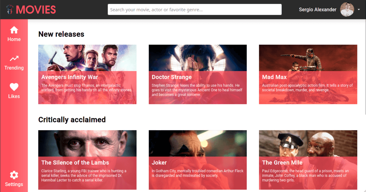
Exercise 1: Movies Page
Create a movie browsing page with a grid of cards. Each card has a poster, title, rating, and description. The grid should adapt to screen size — more columns on wide screens, fewer on mobile.
This exercise teaches:
grid-template-columnswithrepeat()andauto-fitminmax()for responsive column sizing without media queriesgapfor consistent spacing (way cleaner than margin hacks)
My solution: movies-page-css-grid
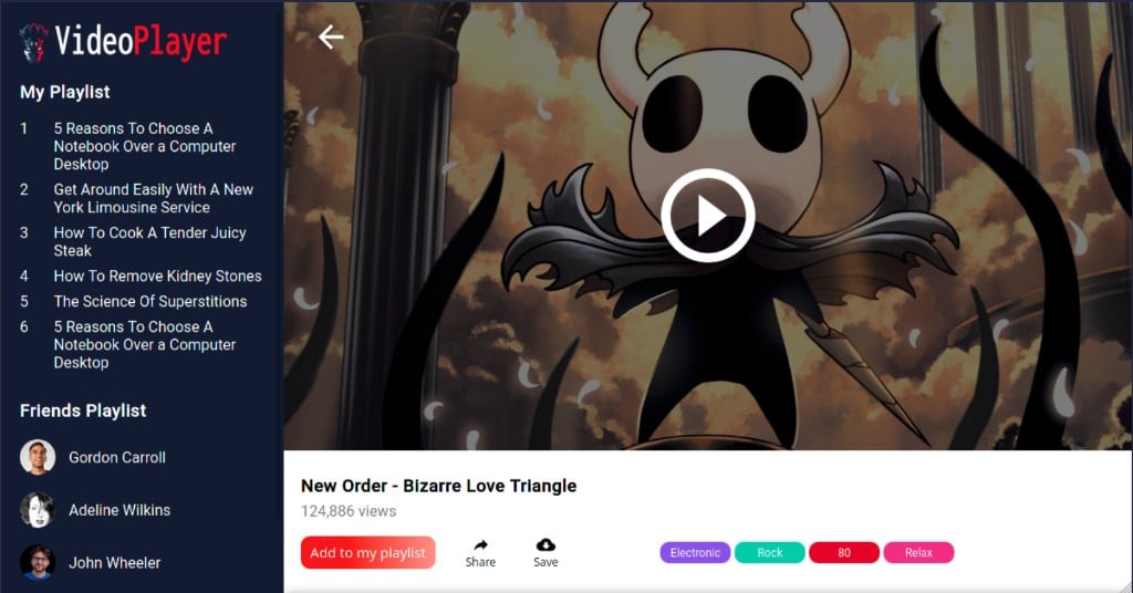
Exercise 2: Videos Player
Build a video player interface with:
- A sidebar with a playlist (left)
- A main video player (center, takes most of the space)
- Video controls and metadata (bottom)
This exercise teaches:
- Named grid areas (
grid-template-areas) - Fractional units (
fr) for proportional sizing - How to make a layout that feels like a real app
Repo: videos-player-css-grid Live demo: videos-player-css-grid.xergioalex.com
I also put together a full course with more examples and interactive demos:
Bonus Tricks from State of CSS 2020
At the end of the talk, I covered two newer CSS features that were gaining traction in 2020:
line-clamp
Truncate text to a specific number of lines with an ellipsis. Super useful for card descriptions, preview text, or anywhere you need to prevent overflow without cutting mid-word.
.card-description {
  display: -webkit-box;
  -webkit-line-clamp: 3;
  -webkit-box-orient: vertical;
  overflow: hidden;
}
This was a lifesaver for the movies page cards.
prefers-reduced-motion
A media query that respects the user’s system-level preference to reduce motion. If someone has enabled “reduce motion” in their OS accessibility settings, you can disable or simplify animations.
@media (prefers-reduced-motion: reduce) {
  * {
    animation-duration: 0.01ms !important;
    transition-duration: 0.01ms !important;
  }
}
This is an accessibility feature that matters. Some people experience discomfort or vestibular issues from excessive motion. Respecting this preference is part of building for everyone.
You can test it in Firefox DevTools by setting ui.prefersReducedMotion: 1 in about:config.
What I Learned
Grid didn’t replace Flexbox for me — it complemented it. Now I reach for Grid when I’m thinking about page structure and Flexbox when I’m thinking about component alignment. They work beautifully together.
The exercises were key. You can read about grid-template-areas all day, but until you actually build a video player layout with named areas, it doesn’t really stick.
If you’re still hesitant about Grid, build something. Not a toy example — a real layout. You’ll see why it’s worth learning.
Let’s keep building.